

 Position:
 10th Anniversary Logo and Mascot Design
As part of our school’s 10 th anniversary celebrations, students and parents were invited to participate in contests to design a 10 th anniversary logo and mascot to mark the occasion.
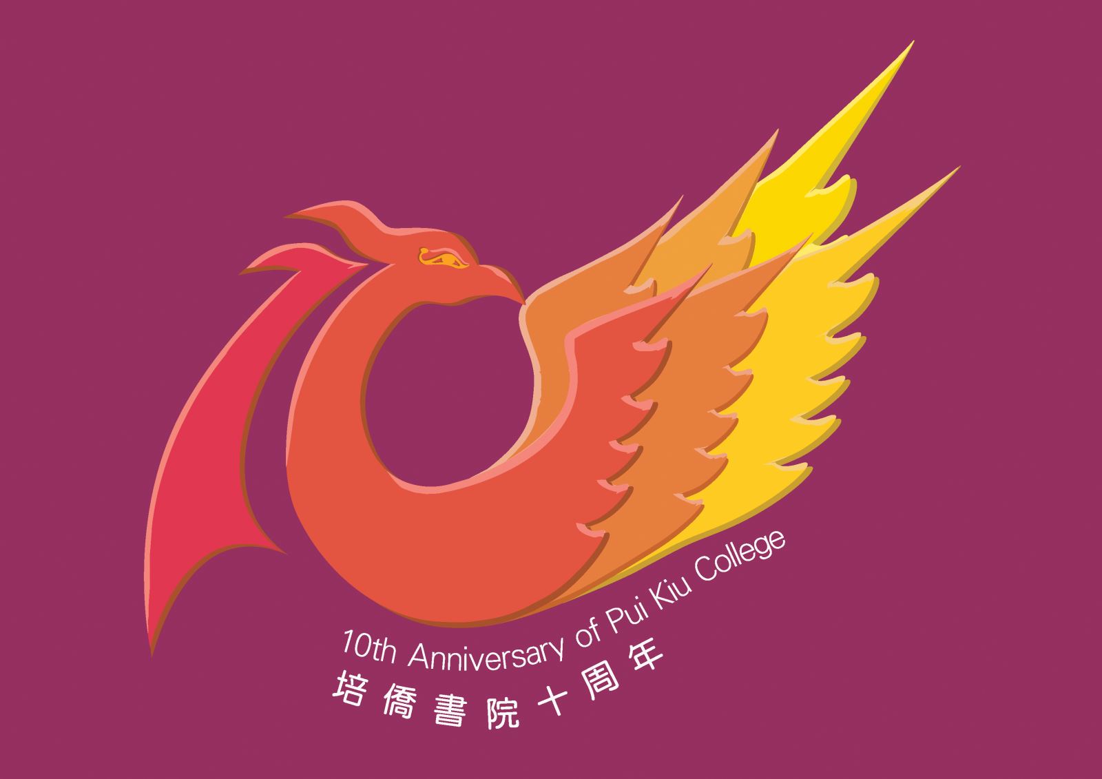
Wong Cheuk Lum (10M) created the winning logo in the 10 th anniversary logo design contest.The logo features a clever combination of the number 10 and the school’s phoenix logo: theshadow to the left of the phoenix makes the number 1 whilst the phoenix craning its neck round towards its out-stretched wings creates a circle to represent the number 0. It represents the birth and the growing stages in the past 10 years. The expanding of the phoenix’s powerful wings symbolizes our school’s 3 rd stage of development, i.e. it is ready to soar in the sky.
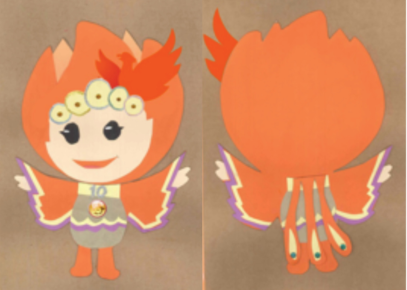
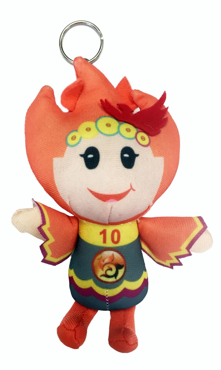
The phoenix was chosen as the school’s emblem to represent the excitement of our school life at Pui Kiu and our energetic students. “Our inspiration for the design comes from the headwear worn by the main characters in Chinese operas. The five small, old coins on its forehead represent the five qualities we expect our students to possess: Intelligence, thoughtfulness, inquisitiveness, creativity and the willingness to take responsibility.
The mascot is predominantly orange. The mascot extends its arms, to set off on its journey. This imagery represents our students’ continuous effort as they strive for excellence. The combination of Chinese and Western elements perfectly demonstrates our school’s mission: to help our students to develop the best qualities from the East and the West.” The mascot is named Pui Pui.